
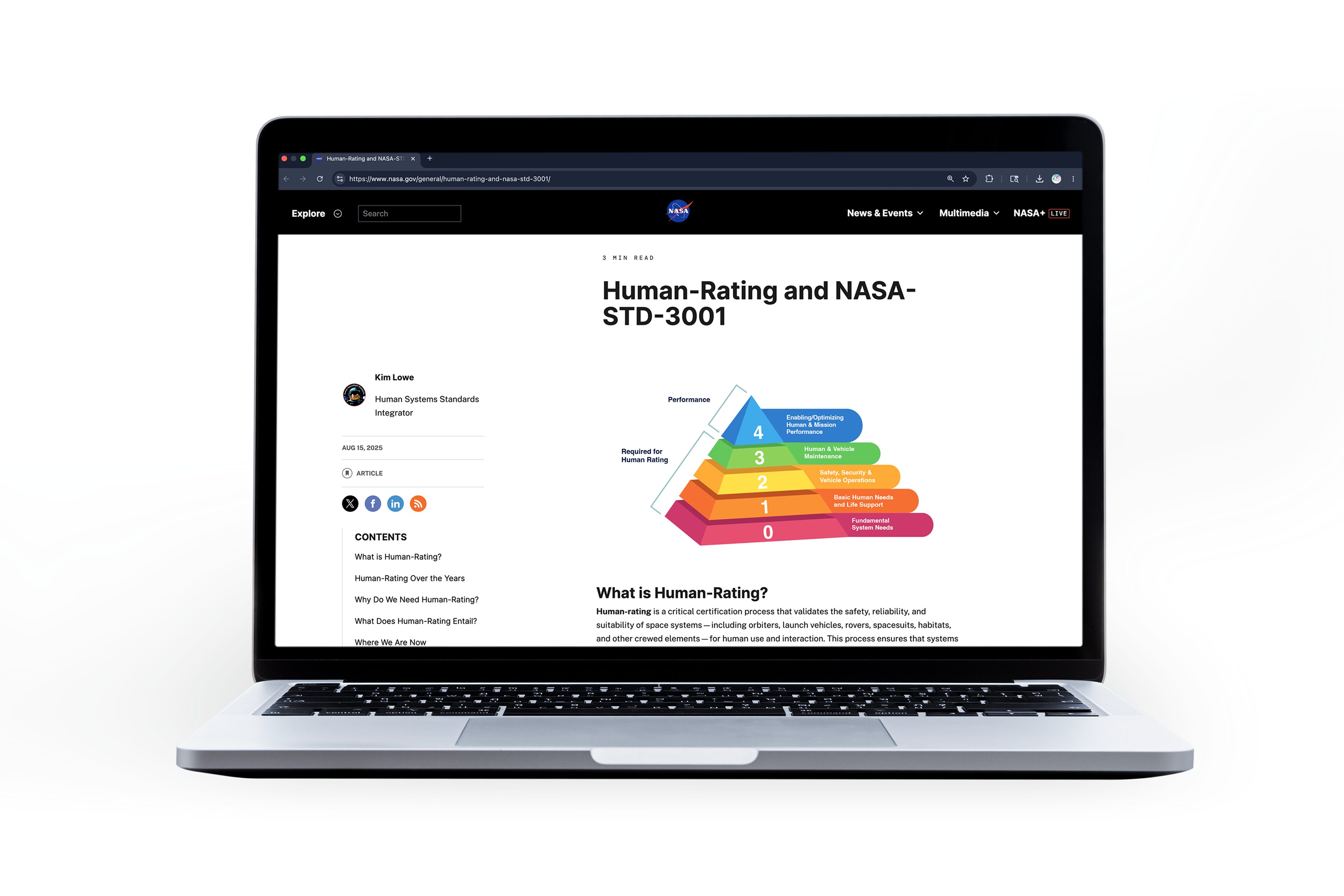
NASA OCHMO Web Graphics
This project, created in collaboration with the NASA Office of the Chief Health and Medical Officer, focused on translating complex Human Spaceflight and Aviation Standards into a more engaging and accessible visual experience. My role centered on combining motion design, information hierarchy, and user-focused problem solving to make dense technical content feel clearer and easier for a public-facing audience to navigate.
In addition to this project, I also manage web updates across other subpages for the OCHMO website through WordPress. Working within the limitations of the platform pushed me to think creatively about layout, visuals, and user engagement. Even with the limited version of WordPress available to me, I was able to create a unique graphic approach that helped draw more attention to the article while still aligning with NASA’s visual standards and accessibility requirements.
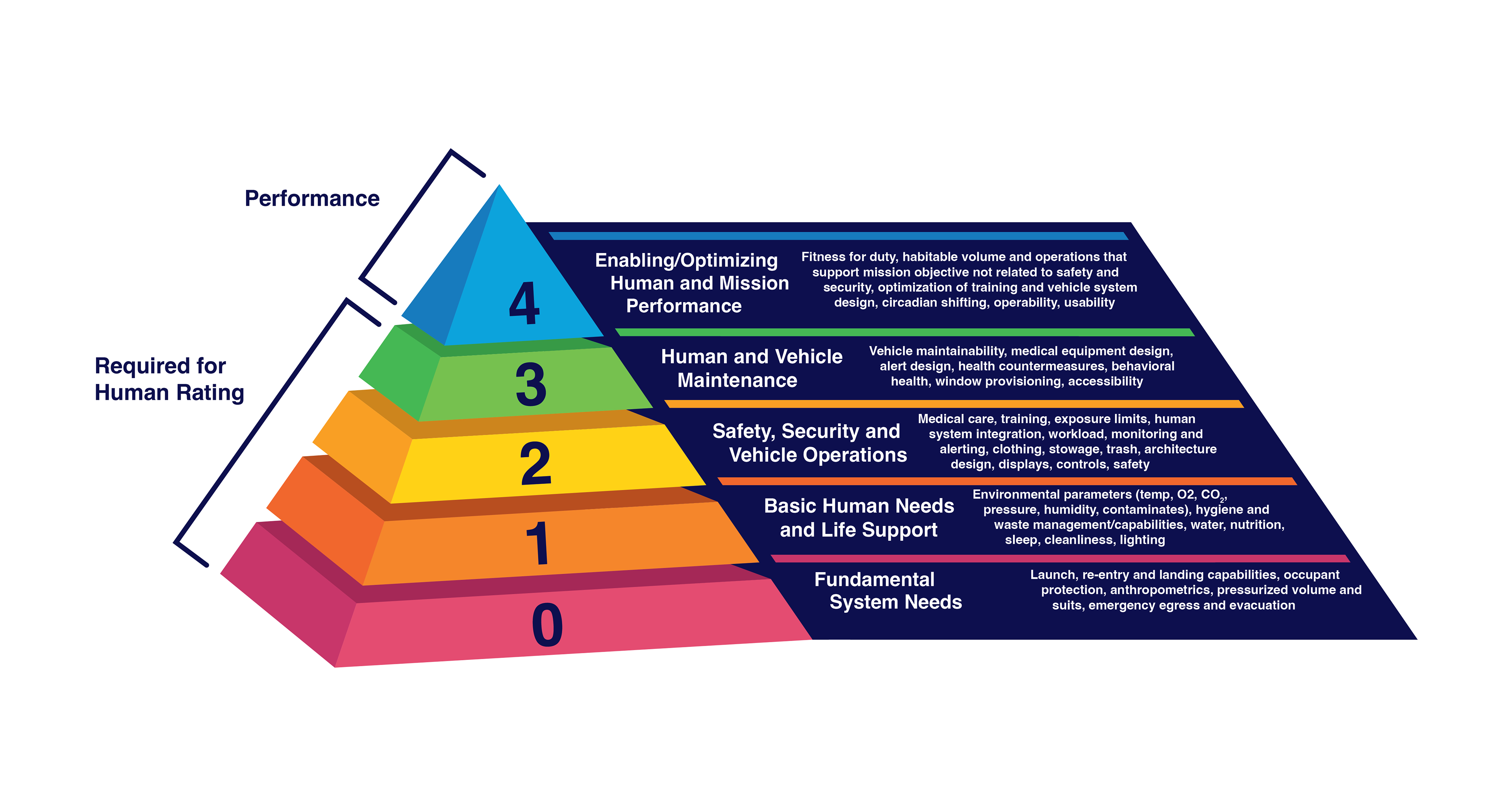
Original Graphic vs My Re-design
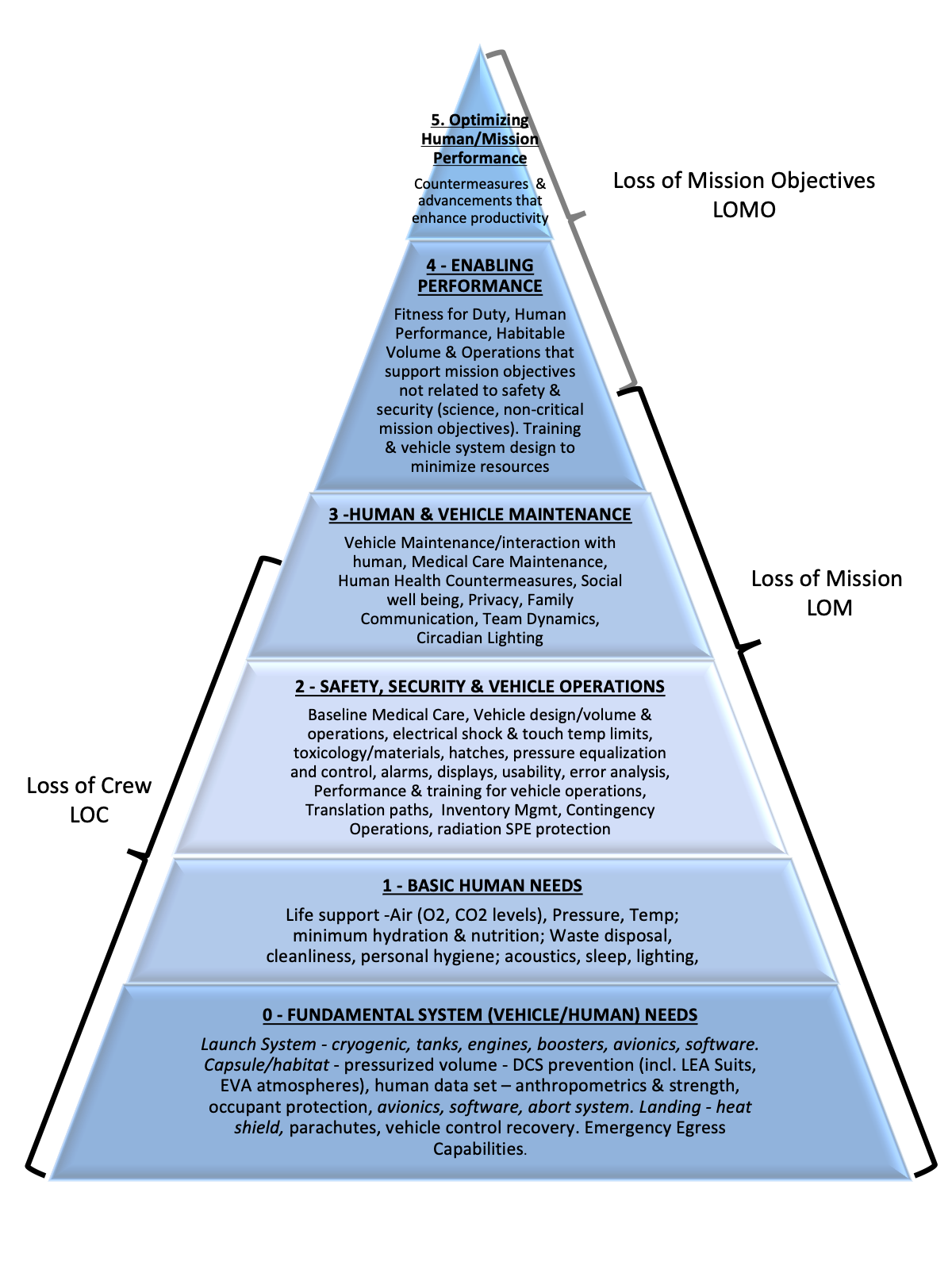
The original concept used a flat pyramid graphic with titles and definitions crowded into each section. One of the key decisions I made was recognizing that the format wasn’t the clearest way to communicate such a large amount of information. I proposed transforming the concept into an animation and restructuring it into a wheel format, which allowed the information to flow more naturally while also creating a more visually engaging experience for website users.
Because the graphic also needed to function within documents and presentations, I designed a static version where the information was positioned alongside the structure rather than compressed inside it. This approach helped maintain a clean, readable design while still preserving a clear connection to the original concept.
Software used : Illustrator, After Effects, Webflow
a